
Data visualization
How to Create an Animated Choropleth Map Online
Learn how to turn country-by-country data into an animated World choropleth map, import values from CSV, configure color grades and no-data regions, and export the result as MP4 or PNG.
A choropleth map uses color to compare one numeric value across geographic areas. Instead of placing a marker on every country, the entire country is filled according to a value range, making regional patterns visible at a glance.
With GenerateAnimatedMap.com, you can create an animated World choropleth in your browser, enter values manually or import a CSV file, control every color grade, and export the finished visualization as an MP4 video or PNG image.
This guide follows the same practical workflow as our US and Russian election map guides, but uses the World map and a general two-column dataset that works for topics far beyond elections.
What is a choropleth map?
A choropleth groups numeric values into grades. Every country whose value falls inside the same grade receives the same color. A light-to-dark sequence usually communicates low-to-high values most clearly.
Choropleths are best for rates, percentages, ratios, averages, and normalized values. When countries have very different population sizes, an indicator such as crimes per 100,000 people is usually more meaningful than the raw number of crimes.
1. Open the map generator
Sign in and open the Create page. The workspace can create animated geographic maps, election maps, routes, bar charts, and line charts.
2. Select the World map
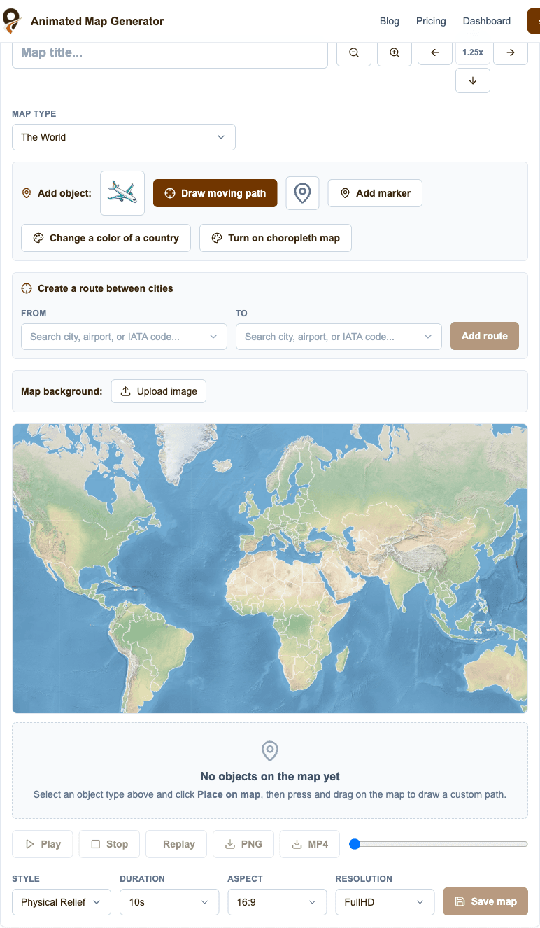
Open the Map Type dropdown and select The World. This guide uses countries as the geographic unit. The same choropleth workflow is also available for US states and Russian regions.
Choose a starting visual style now or change it later. Physical Relief works well for geographic storytelling, while Minimal News and Clean Light are useful when the data should dominate the frame.
3. Turn on the choropleth map
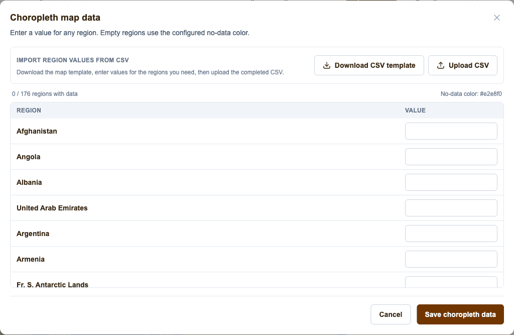
Click Turn on choropleth map. A data window opens with one row for every country on the World map. Enter a numeric value for any country you want to classify. Countries with an empty value remain in the no-data color.
You do not need to populate every country. This is useful when your source covers only one continent, a group of markets, or a selection of countries discussed in your video.
4. Enter values manually or import a CSV file
For a small dataset, type values directly into the country rows. For a larger dataset, download the CSV template, fill the value column in Excel, Google Sheets, Numbers, or another spreadsheet tool, and upload the completed file back into the same window.
The World template uses two columns: country,value. For example: Germany,82; France,74; Italy,61. Keep the header and country names from the downloaded template so the importer can match every row reliably.
Blank value cells are allowed. They are treated as missing data rather than zero. After importing, you can still correct individual values manually before saving.
- Download the World CSV template from the data window.
- Enter numeric values only in the value column.
- Keep one country per row and do not rename the columns.
- Upload the CSV and review the populated inputs.
- Click Save choropleth data when the values are ready.
5. Configure the color grades
After saving the data, open the Choropleth map panel in the right sidebar. Each grade has a color and an inclusive upper limit. The final color is used for every value above the last numeric step.
For example, grades ending at 20, 40, 60, and 80 create five visual classes: up to 20, 20–40, 40–60, 60–80, and above 80. Adjust the steps to match the distribution and unit of your own dataset.
Use an ordered single-hue or multi-hue scale with a clear progression. Avoid assigning unrelated rainbow colors unless the classes represent genuinely different categories rather than increasing values.
6. Set the no-data color, opacity, and legend
Choose a neutral no-data color that is visibly different from the lowest grade. A pale gray usually communicates that no value was supplied without competing with the data colors.
Fill opacity controls how strongly the choropleth covers the underlying map style. Lower opacity reveals more terrain and texture; higher opacity makes exact classifications easier to read.
Keep the legend visible when viewers need to interpret the thresholds. Give it a specific title such as Crime rate per 100,000, GDP per capita (USD), Internet access (%), or Annual rainfall (mm).
7. Preview and export the animation
Choose the video duration and aspect ratio below the preview, then click Play to review the animation. Use 16:9 for YouTube and presentations, 9:16 for Shorts, Reels, and TikTok, or 1:1 for square social posts.
Give the project a descriptive title, save it, and export it as MP4 for video editing or PNG for a static article, thumbnail, presentation, or social post.
Choropleth map ideas for the World map
The strongest choropleth topics have one comparable value for each country and a unit that means the same thing everywhere. Here are useful starting points for videos, journalism, education, research summaries, and social content.
- Crime rate by country, preferably expressed per 100,000 people rather than as a raw total.
- Population density, showing people per square kilometer.
- GDP per capita, median income, economic growth, inflation, or unemployment rate.
- Life expectancy, infant mortality, vaccination coverage, or doctors per 1,000 people.
- Internet penetration, smartphone adoption, social-media usage, or broadband speed.
- Renewable-energy share, electricity access, carbon emissions per capita, or air-quality indicators.
- Average temperature, annual rainfall, drought severity, forest coverage, or protected land share.
- International arrivals, tourism revenue per capita, passport access, or hotel capacity.
- Election turnout, public-opinion percentages, democracy indices, or press-freedom scores.
- Education spending, literacy rate, university enrollment, or average years of schooling.
How to prepare trustworthy data
A polished map can still be misleading if the underlying values are not comparable. Use one reputable source when possible, verify that every country uses the same year and unit, and document any countries with missing or estimated values.
Choose raw totals only when total scale is the story. For comparisons of risk, access, behavior, or performance, normalize by population, area, GDP, or another appropriate denominator.
Review the distribution before setting grades. If most values cluster together and one or two countries are extreme outliers, equal-width grades may hide the pattern. Adjust the thresholds so meaningful differences remain visible, and state the method in your caption or narration.
Create choropleth maps through MCP
The same World choropleth can also be created through the Generate Animated Map MCP integration. You can ask a compatible AI client to create a World choropleth, provide country-value pairs, and specify grade colors, limits, the no-data color, opacity, and legend title.
For example: Create a World choropleth titled Internet access by country using these values, use five blue grades, color missing countries light gray, and show a legend titled Internet users (%). The generated project remains editable in the web interface.
Frequently asked questions
What data format does the World choropleth map use?
Use two CSV columns named country and value. Downloading the built-in template is the safest way to preserve supported country names.
Do I need a value for every country?
No. Empty countries use the configured no-data color, so partial datasets are supported.
Can I choose my own thresholds and colors?
Yes. Every grade color and numeric upper limit is editable in the Choropleth map panel. You can also add or remove grades.
Should I map total crime or crime rate?
For comparing countries, a rate such as incidents per 100,000 people is usually more meaningful because raw totals are strongly affected by population size. Always label the unit and source clearly.
Can the choropleth be exported as a video?
Yes. Save the project and export it as an MP4 animation or PNG image.
Does choropleth mapping also work for the USA and Russia?
Yes. The same feature supports US states and Russian federal regions. This guide uses the World map as the example.