
Data visualization
How to Create an Animated Line Chart Video Online
Learn how to create a customizable animated line chart with multiple data series, editable X- and Y-axis values, line animations, delays, point markers, colors, and MP4 or PNG export.
An animated line chart is one of the clearest ways to show growth, change, and comparison over time. It works especially well in YouTube videos, news reports, presentations, product updates, Instagram Reels, TikTok posts, and data-driven explainers.
With GenerateAnimatedMap.com, you can build a line graph directly in your browser. Add shared X-axis points, plot up to 20 separate lines, enter a Y value for every point, and configure the color, animation, delay, width, and marker style of each line.
You do not need After Effects, chart templates, or motion-design experience. This guide walks through the complete workflow, from entering your dataset to exporting the finished graphic as an MP4 video or PNG image.
1. Open the animated chart generator
Sign in and open the Create page. The same workspace can create animated maps, bar charts, election graphics, route animations, and line charts.
2. Select Animated Line Chart
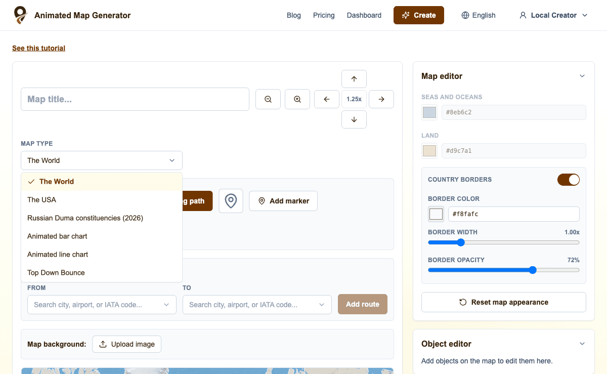
Open the Map Type dropdown and select “Animated line chart.” The map controls disappear, the preview becomes a line-chart canvas, and the sidebar displays graph-specific settings.
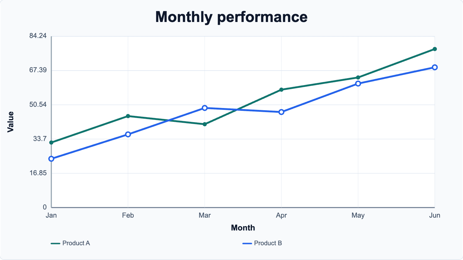
A sample monthly performance chart is loaded automatically. It includes two lines so you can immediately see how multiple series, colors, legends, and point markers work together.
3. Set up the X-axis points
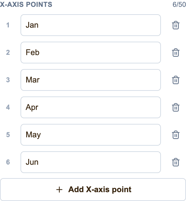
The X-axis points define the shared steps along the bottom of the graph. They can be months, years, quarters, dates, distances, product stages, age groups, or any other ordered categories.
Edit the sample labels, click “Add X-axis point” to add another step, or remove points you do not need. You can create up to 50 X-axis points. Every line receives a matching Y-value field for each point, so the data stays aligned across the graph.
Keep labels concise when creating a portrait or square video. Longer labels rotate automatically when space becomes limited.
4. Enter the Y values for each line
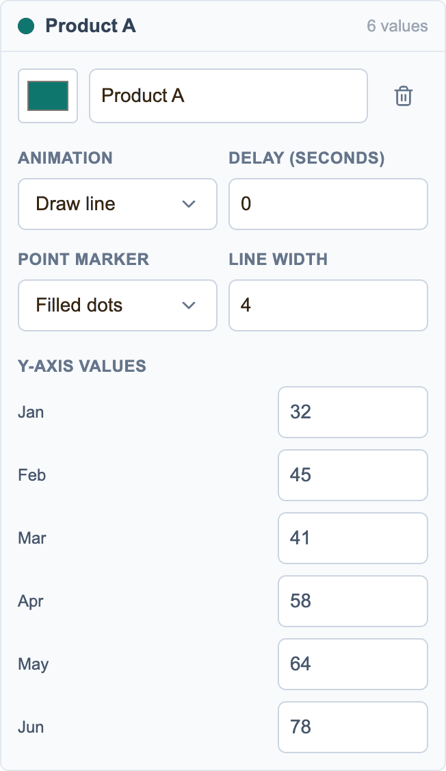
Open a line in the Lines section to edit its data. A Y-value field appears for every X-axis point. Enter the numeric value where that line should intersect each step of the graph.
For example, if the X axis contains Jan, Feb, and Mar, a revenue line might contain 32, 45, and 41. The preview redraws immediately as you type. Positive and negative values are supported, and the Y-axis scale adjusts automatically to fit the complete dataset.
Click “Add line” when you want to compare another product, country, candidate, metric, or time series. A chart can contain up to 20 lines.
5. Customize every line
Each line has its own name and color. The name appears in the legend, while the color controls both the path and its point markers. This makes it easy to match brand colors or distinguish several related datasets.
You can also set the width of each line independently. Use a heavier line to emphasize the most important series and thinner lines for supporting data.
6. Choose an animation and appearance delay
Every line can use its own animation. You can have the main line draw first, delay a comparison line, and reveal another series with a fade or rise effect.
The Delay field is measured in seconds and controls when that line begins to appear. Staggering several lines helps viewers focus on one trend at a time instead of receiving the whole graph at once.
The available line animations are:
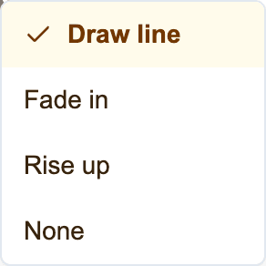
- Draw line — traces the series from left to right across the X axis
- Fade in — gradually reveals the complete line and its points
- Rise up — moves the line upward into its final position
- None — displays the line immediately after its configured delay
7. Add dots, circles, squares, or diamonds
Point markers show the exact intersection between each X-axis step and its Y value. They can make individual observations easier to identify, especially when a line changes direction or several lines cross.
Choose a marker style separately for every line. You can also select No Points when you want a clean path without visible markers.
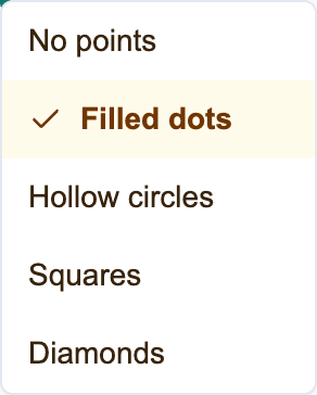
- No points for a minimal line-only graph
- Filled dots for compact, clear data points
- Hollow circles for an open marker style
- Squares for a more technical appearance
- Diamonds for highlighted or contrasting series
8. Configure titles, labels, the legend, grid, and colors
Give the graph a clear Chart Title, then add X-axis and Y-axis labels that explain what each dimension represents. Use the display switches to show or hide exact data labels, the series legend, and reference grid lines.
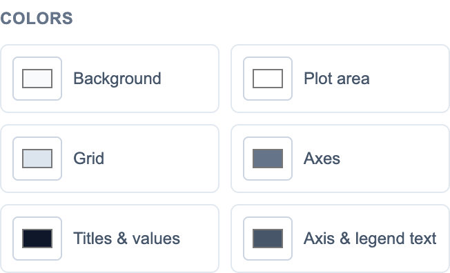
The Colors section controls the background, plot area, grid, axes, titles and values, and axis and legend text. These settings let the chart match a presentation, website, channel identity, documentary, or social-media design.
For a busy graph with many lines, hide data labels and keep the legend. For a graph with only one or two lines, visible values can make the result easier to understand.
9. Preview the line-chart animation
Click Play to see the complete sequence, including every per-line animation and delay. Pause or Stop when you want to inspect the composition, and use Replay to restart from the beginning.
The progress slider lets you inspect any moment manually. This is useful for checking when a delayed line begins, how quickly a path draws, and whether point markers appear at the right stage.

10. Choose the duration, aspect ratio, and resolution
Choose 5, 10, 15, or 30 seconds for the animation. Make sure delayed lines have enough time to complete their entrance before the video ends.
Use 16:9 for YouTube, presentations, and landscape video. Use 1:1 for square Instagram or LinkedIn posts, and 9:16 for TikTok, Instagram Reels, and YouTube Shorts. The chart spacing and legend automatically adapt to the selected format.
Select HD, FullHD, or 4K depending on the resolution required by your project.
11. Save and export as MP4 or PNG
Enter a project name in the Animation Title field and click Save. The saved project keeps the complete dataset, all line settings, markers, colors, delays, duration, and aspect ratio together for later editing.
After saving, click MP4 to render an animated video or PNG to download a static image. The video can be imported into an editor, added to a presentation, or published directly on a social platform.
12. Create an animated line chart through ChatGPT
If you use the Generate Animated Map ChatGPT plugin, you can describe the graph in natural language instead of entering every setting manually. Ask ChatGPT to create an animated line chart, provide the X-axis points and the values for each series, and specify colors, animation styles, delays, marker types, or the output format.
The plugin can create the editable project, return a link to the web editor, read the current chart configuration, and apply follow-up changes. For example: “Create a 10-second line chart comparing monthly website traffic for Product A and Product B. Draw Product A first, delay Product B by one second, and use hollow-circle markers.”
Ideas for animated line-chart videos
Line charts are most useful when the direction and pace of change matter. Multiple lines make it possible to compare related trends across the same sequence of X-axis points.
- Revenue, sales, traffic, or subscriber growth over time
- Stock, cryptocurrency, or market-index comparisons
- Temperature, rainfall, energy, or climate measurements
- Election polls and approval ratings
- Sports performance across games or seasons
- Product usage, retention, or conversion metrics
- Population, employment, or economic indicators
- Scientific measurements and experiment results
Frequently asked questions
Can I create an animated line chart without After Effects?
Yes. GenerateAnimatedMap.com builds and animates the line graph in your browser. Enter the dataset, configure the lines, preview the result, and export it without manually animating paths in After Effects.
How many lines can I add to one graph?
You can add up to 20 independently configured lines. Every line can have its own name, color, width, animation, delay, point-marker style, and Y values.
Can I hide the dots on an animated line chart?
Yes. Set Point Marker to No Points for any series. You can also use filled dots, hollow circles, squares, or diamonds.
Can different lines start at different times?
Yes. Each line has an independent delay measured in seconds, so you can reveal the series one after another or start them together.
Which line-chart animations are available?
Each line can draw from left to right, fade into view, rise into position, or appear without an entrance effect after its configured delay.
Can ChatGPT create and edit the line chart?
Yes. The Generate Animated Map plugin exposes tools for creating an animated line chart and updating its data, colors, animations, delays, markers, duration, aspect ratio, and display settings.
Can I export a line chart for YouTube, TikTok, or Instagram?
Yes. Select 16:9 for YouTube, 9:16 for TikTok, Reels, and Shorts, or 1:1 for square posts. Export the finished graph as an MP4 video or PNG image.