
Data visualization
How to Create an Animated Bar Chart Video Online
Learn how to create a customizable animated bar chart, add your own X- and Y-axis data, configure labels and colors, preview the animation, and export it as an MP4 video or PNG image.
Prefer a video guide? Watch the step-by-step tutorial below.
If you are looking for a simple way to create an animated bar chart for YouTube, Instagram, TikTok, a news video, a presentation, or a data-driven explainer, you are in the right place.
With GenerateAnimatedMap.com, you can now create more than animated maps. The generator includes a dedicated Animated Bar Chart mode where you can enter your own categories and values, choose an animation style, configure the legend and axis labels, customize every important color, and export the result as a video.
You do not need After Effects, chart animation templates, or advanced motion-design skills. This guide shows you how to build a complete animated bar chart directly in your browser.
1. Open the animated chart generator
Sign in and open the Create page. This is the same workspace used to make animated maps, election visualizations, and route animations.
2. Select Animated Bar Chart
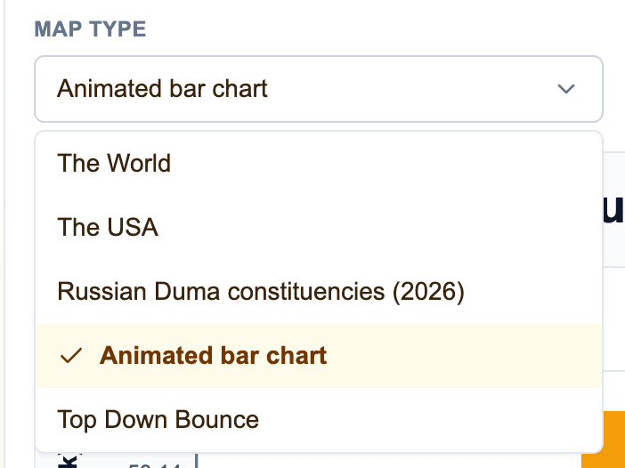
Open the Map Type dropdown and select “Animated bar chart.” Even though this option is inside the map generator, it does not display a map. The preview area switches to a complete bar-chart canvas and the sidebar changes to chart-specific controls.
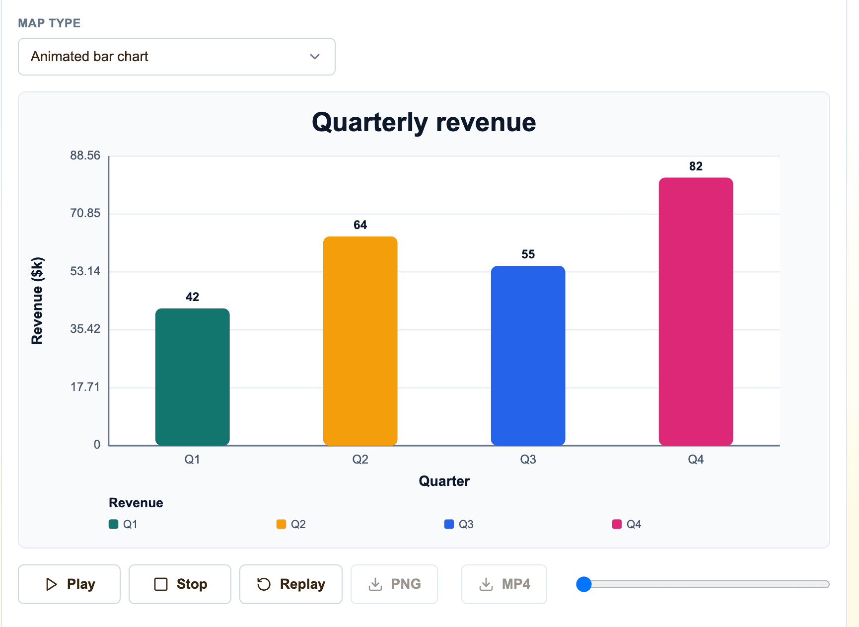
A sample quarterly revenue chart is loaded automatically, so you can immediately see how the chart will look before replacing the example data with your own.
3. Add your X- and Y-axis data
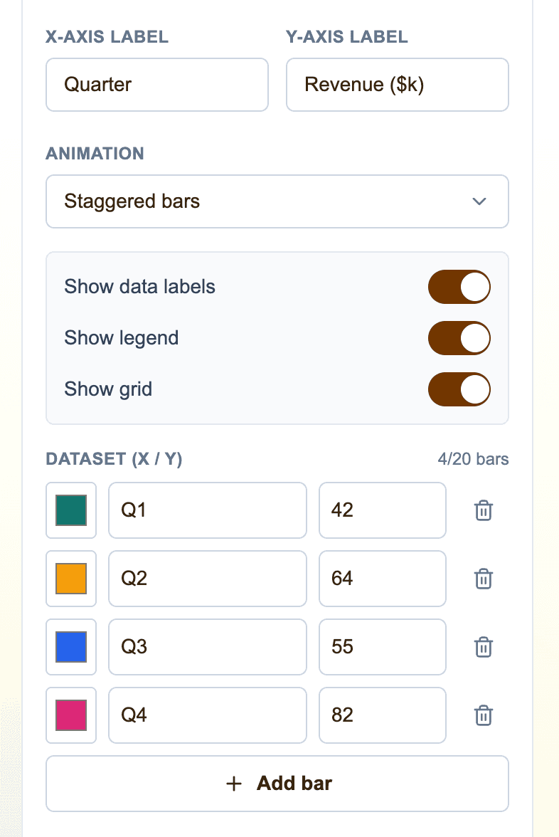
Use the Dataset (X / Y) section in the right sidebar to enter the information that should appear in your chart.
The X-axis field is the category name, such as a year, country, product, candidate, month, or company. The Y-axis field is the numeric value represented by the height of the bar. Negative values are also supported and appear below the zero line.
Click “Add bar” to create another data row. You can add up to 20 bars, remove rows you do not need, and edit the data at any time. The preview updates immediately after every change.
4. Choose a color for every bar
Each data row has its own color picker. This makes it easy to highlight one important result, use brand colors, compare political parties, separate product categories, or match the visual identity of your channel.
You can also set a default bar color in the Colors section. New bars receive a chart color automatically, and you can replace it with any color you want.
5. Set the chart title, legend, and axis labels
Add a clear Chart Title that explains what your visualization shows. You can also enter a Legend Title, an X-axis label, and a Y-axis label.
For example, a chart about quarterly revenue could use “Quarterly Revenue” as the title, “Quarter” for the X axis, “Revenue ($k)” for the Y axis, and “Revenue” as the legend title.
All text changes appear in the preview immediately, so you can keep the labels short enough for the selected video format.
6. Select the bar chart animation
Choose how the bars should appear when the video starts. You can change the animation at any time and compare the options with the Play and Replay buttons.
The available animation styles are:
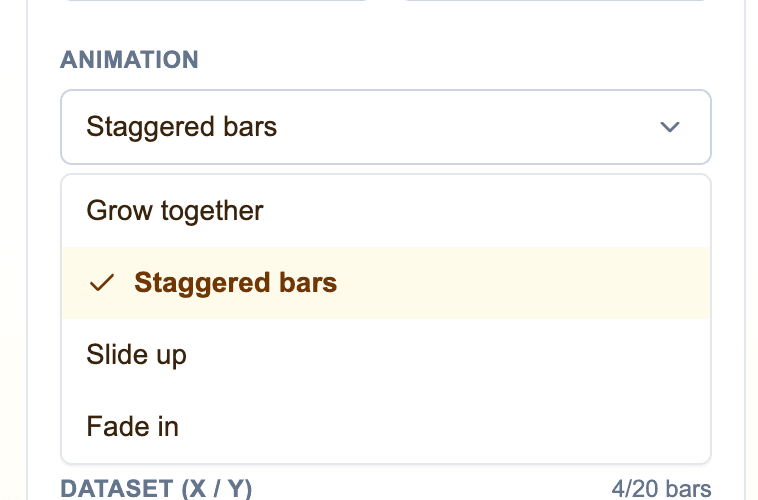
- Grow together — all bars grow from the zero line at the same time
- Staggered bars — bars appear one after another from left to right
- Slide up — bars move upward into their final positions
- Fade in — the complete chart gradually becomes visible
7. Configure data labels, the legend, and grid lines
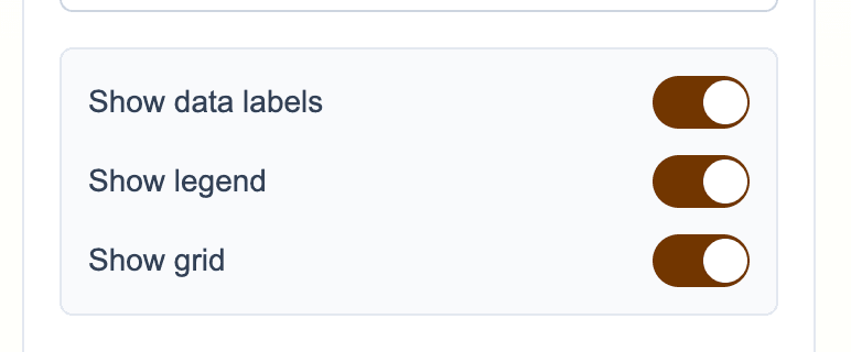
Use the display switches to decide how much information should be visible in the final chart.
Show Data Labels displays the exact number above or below each bar. Show Legend adds color keys and category names. Show Grid displays horizontal reference lines that make it easier to compare values.
For a minimal social-media graphic, you may want to hide the grid or legend. For a news report, presentation, or analytical video, keeping them visible can make the chart easier to understand.
8. Customize all chart colors
The Colors section lets you match the chart to your brand, video, presentation, or website. You can independently configure the background, plot area, default bar color, grid lines, axes, titles and values, and axis and legend text.
A light background works well for presentations and educational content. A dark background with bright bars can be more effective for documentaries, news videos, and social media. Because every part has its own color control, you are not limited to a fixed template.
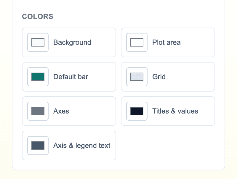
- Background color
- Plot-area color
- Default bar color
- Grid-line color
- Axis color
- Title and value color
- Axis-label and legend-text color
9. Preview your animated bar chart
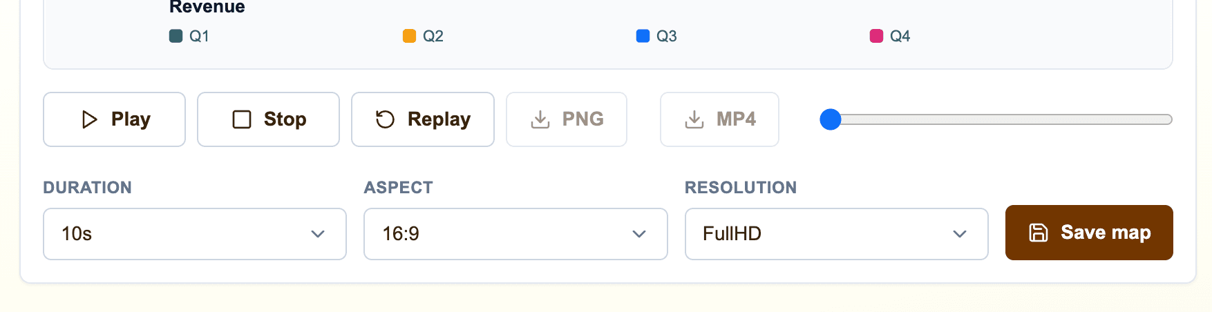
Click Play to preview the chart animation. Use Pause and Stop when you want to inspect a frame, or click Replay to restart the animation from the beginning.
You can also drag the preview progress slider to inspect different moments manually. This is useful when testing staggered animations or checking when a particular bar appears.
10. Choose the duration, aspect ratio, and resolution
Set the duration of the animation and choose a format that matches the platform where you plan to publish it. The chart automatically rearranges its spacing for landscape, square, and portrait videos.
Use 16:9 for YouTube videos, presentations, and standard landscape content. Use 1:1 for square Instagram or LinkedIn posts. Use 9:16 for TikTok, Instagram Reels, and YouTube Shorts.
You can also select the export resolution, including HD, FullHD, and 4K, depending on the quality needed for your project.
11. Name and save your chart project
Enter a project name in the Animation Title field at the top of the page, then click Save. Saving keeps the chart configuration, dataset, labels, colors, animation style, duration, and aspect ratio together so you can return and edit the project later.
You must save the project before the PNG and MP4 export buttons become available.
12. Export the animated bar chart as MP4 or PNG
Click MP4 to render the chart as a video you can import into your video editor or publish on a social platform. Click PNG when you need a static chart image for a thumbnail, presentation, article, or social post.
Paid subscription exports do not include the free-plan watermark. You can use the exported chart as finished content or as a starting point for additional editing, narration, sound effects, and transitions.
Ideas for animated bar chart videos
Animated bar charts can explain comparisons much faster than a table of numbers. They are useful whenever your story contains categories and values that should be compared visually.
- Population or economic comparisons between countries
- Election results, polling numbers, or seat totals
- Revenue, sales, traffic, or audience growth
- Sports scores and team statistics
- Product, company, or market comparisons
- Survey results and research findings
- YouTube channel, TikTok, or Instagram analytics
- Historical data shown year by year
Frequently asked questions
Can I create an animated bar chart without After Effects?
Yes. GenerateAnimatedMap.com creates the chart animation in your browser. Enter your data, choose the colors and animation, then export the result as an MP4 video without manually animating shapes in After Effects.
Can I use my own X- and Y-axis data?
Yes. Every bar has an editable X-axis category and Y-axis numeric value. You can add, edit, reorder by changing the rows, or remove bars and see the result immediately in the preview.
Can an animated bar chart display negative values?
Yes. Negative values are supported and are drawn below the chart's zero line, while positive values appear above it.
Can I customize the chart colors and labels?
Yes. You can set an individual color for every bar and configure the background, plot area, grid, axes, titles, values, axis labels, legend text, chart title, axis titles, and legend title.
Which animated bar chart styles are available?
The generator currently supports bars growing together, staggered bar entrances, bars sliding upward, and a fade-in animation. You can preview each option before exporting.
Can I export the chart for YouTube, TikTok, or Instagram?
Yes. Use 16:9 for YouTube, 9:16 for TikTok, Reels, and Shorts, or 1:1 for square social posts. The finished chart can be exported as MP4 video or PNG image.